Helga Gebert: Märchenbilder
Helga Gebert has been drawing, painting, writing and translating fairy tales and stories for around 80 years. Most of the pictures have been published as book illustrations, others are still part of an open research project, in which she deals with sagas, myths and stories and gives their contents an imaginative and detailed face.
For the exhibition in the Försterhaus Reute, a selection of different themes from her oeuvre was chosen: Grimm's fairy tales, stories from 1001 Nights and witches, giants and dragons. In addition, there is a selection of drawings and sketches from different creative periods.
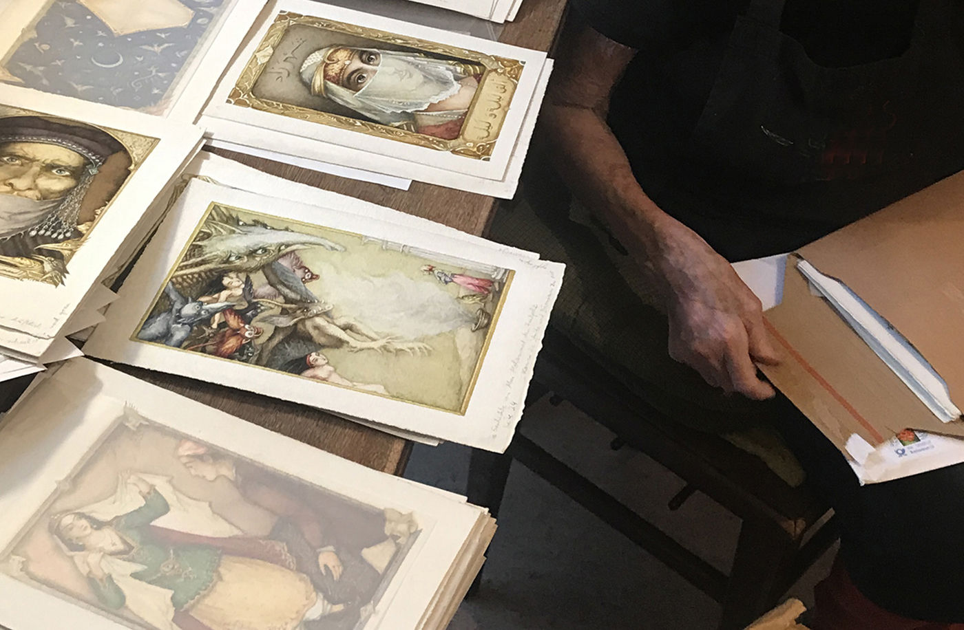
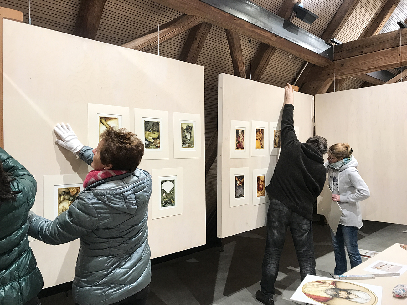
The project includes curating, designing and realising the exhibition together with members of the association that runs the Försterhaus.
Architecture Institute Rotterdam
The Architecture Institute Rotterdam (AIR) is located in an office building on the Waalhaven in Rotterdam, designed in 1945 by the architect Ad van der Steur. The former administrative floors have been renovated in the past and are now characterised by an open-plan organisation. In principle, this benefits AIR's dynamic working culture, but provided a rather generic environment with few nuances and problematic acoustic and lighting conditions. The visible installations and the outdated lighting system also made for a sterile, cluttered working environment. As this is a listed building, the redesign was not allowed to interfere with the substance of the building.
The restructuring of the offices has created a new sequence of spaces, with zones of different qualities. The lighting on the entire floor was recalculated and replaced by new fittings with spherical hanging lamps. Through a large sound buffering sliding door, there is the possibility of completely separating one part of the space. This is where the future library will be located, which will be housed in the cupboard elements on either side of the door.
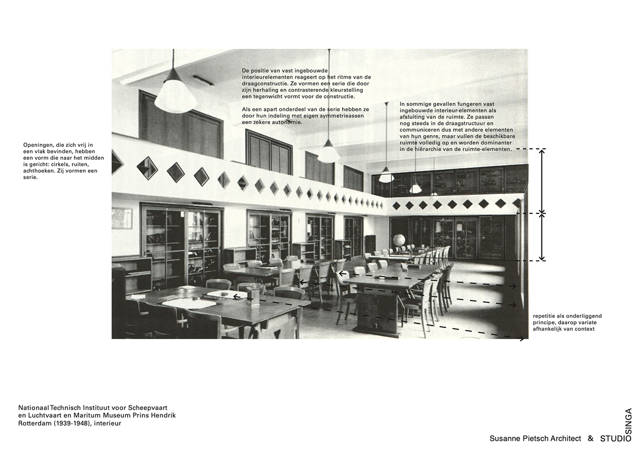
Van der Steur interiors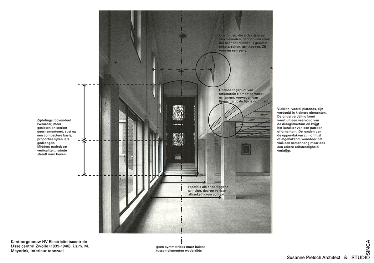
The cupboards are made of a specially designed and built modular system of plywood, oiled in a shade of green. The below part of the doors are clad with panels of folded steel. Proportions, dimension and surfaces of the intervention refer to principles that van der Steur applied to the interiors he designed.
- Related Projects
- Foyer Goethe Institut
Thicket
Ongoing screen printing project on various media. An attempt to transfer plant motifs in up to three-colour layering onto various interior surfaces and clothing.
The study focuses on the nature of abstraction, the effect of the motif in relation to its application in space and the technical aspects of printing on the specific material.
The aim is to develop a series of objects and garments to be produced locally in small batches.
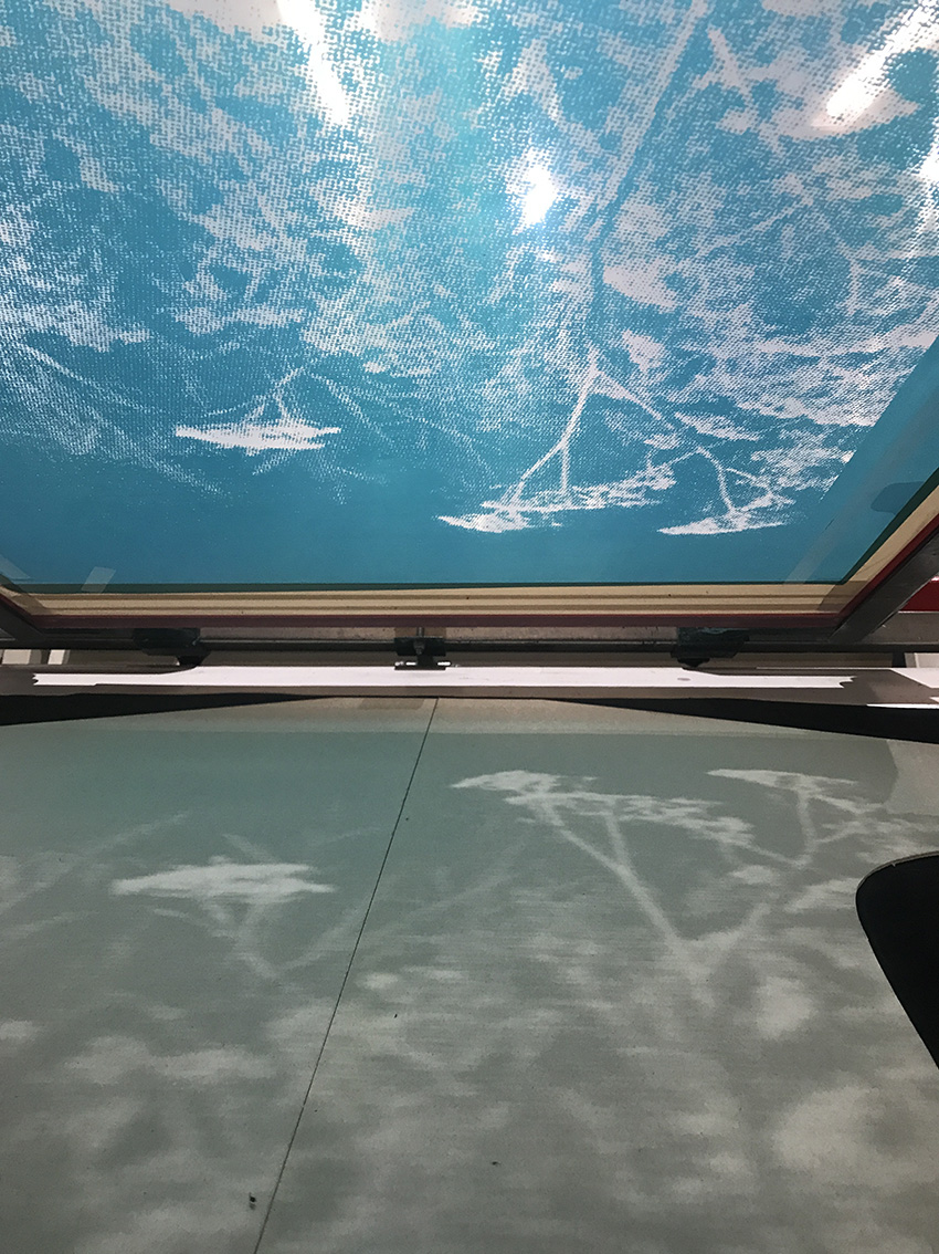
During printing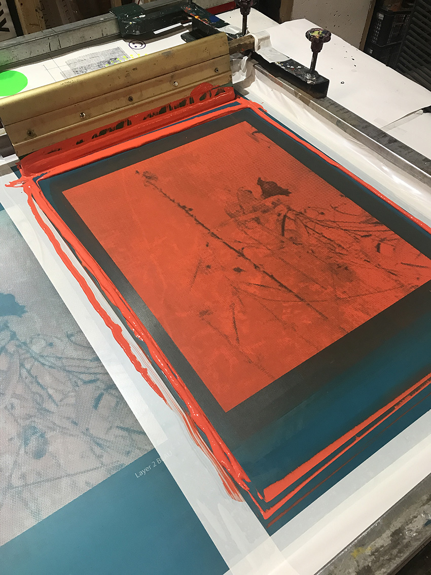
- Related Projects
- The Air we all Breathe
- Dressing table
- Small Bench
The Air we all Breathe
“Pipes, ducts, radiators, switches, grilles, fire detectors, sensors, sockets, cabinets, air-conditioning units, ceilings, emergency lighting...”
A research project to develop new prototypes for an interdisciplinary approach to the interior and its installations for conditioning the indoor climate.
In the context of climate change, technical aspects of buildings are becoming increasingly important. The parameters for their implementation are largely technological, while their spatial functioning has cultural, social, sensory, and ultimately ethical aspects. We believe that an integrated and interdisciplinary approach to the interior and its installations has great potential—not only for better coordination of conventional solutions, but above all for the development of new spatial models that take the complex effects of the built environment into account.
Cultural significance
Global warming, the depletion of raw materials, air and water pollution, and the loss of biodiversity are the most important issues of our time. Climate was the first reason for interior design, and is still a major influence for it. Interior spaces and the climate are coordinated. In the pre-modern era, (interior)-architectural means such as walls, windows, pitched roofs, ceilings, verandas, and fireplaces were used to control the temperature and the regulation of the indoor climate. These means were often accompanied by socio-cultural rituals, from cleaning to storytelling.
The fireplace, for example, was the source of heat, but also the place where food was originally prepared and where people sat together. Later, it moved from the centre towards the wall, but stayed a central element of the room, framed by a mantelpiece and decorated with ornaments. The radiator has been moved to its logical place under the window, and thus has shifted from the centre of attention to a servicing role at the edge of the room, losing its cultural importance.
In modern times, climate conditioning has largely been solved by mechanical, electrical, or digital technology, and has become a field dominated by specialists. This technical layer has been added to buildings, and interior decoration has mainly a functional-technical meaning. As a result, the interior detaches itself from its history and loses its cultural value.
Sensory experience and user comfort
Installations intend to create comfort, but their influence on the design of the interior and its appearance as objects are seen as secondary. The sensory qualities of the interior—light colour, smell, air movement, and haptic characteristics—form a connection between man and the elements, and as they become the heart of the interior design,the physical reality of the space becomes secondary.
Apart from the user aspects of rooms and furniture, the indoor climate has a major influence on the user’s satisfaction with their spatial environment, particularly with the temperature, light, sound, and air quality. The technological developments in climate installations and other systems are becoming increasingly complex, and consequently, a users’ influence on their micro-climate is becoming smaller and smaller. They are based on standards which do not necessarily take the actual comfort of the user into account.
The hidden impact
Due to a growing awareness of the ecological impact of energy consumption in buildings, technology and associated regulations for conditioning indoor climates seem to be playing an increasingly important role in the realisation of building interiors; however, at the expense of structural / architectural resources. A growing industry dedicated to the production and application of technical building systems has thus become an economically-oriented discipline.
The technological infrastructure of installations swallows a significant proportion of available construction budgets, reducing the resources available for design. Technological developments and the limited lifespan of these technical infrastructures and systems mean that they have to be replaced every 10—20 years; detrimental towards climate change and exacerbating a waste problem. In addition, an emphasis is often on the immediate savings that these systems deliver within a local context. This does not take the entire ecological footprint of the investment into sufficient account—including material, transportation, and the working conditions of its production.
Position and goals
As a hypothesis, we state that conventional installation technologies for conditioning indoor climates involve high production, consumption, and disposal costs. These can (partly) be replaced by the design and organisation of the interior by, among other things, using archaic methods to temper both the outside, in-between, and inside climate. The background idea is to consider air as a global common good that connects everything with everyone—so that not only discrete separate climates are created; but that a spatial approach is found to intermediate spaces, and connections can run from local to global—in order to see the climate issue in a larger context.
We also think that current building processes provide too few possibilities to arrive at an integrated thought on the design of the interior and its installations. Various areas of expertise act separately from one another, while weighing up the various parameters that could possibly lead to simpler, more specific solutions. The starting point for this would be an interdisciplinary exploration of the criteria that has been put forward by technicians, designers and users when thinking about an interior.
In doing so, a repositioning of the current moment in design history is important; in order to anchor interior design more firmly in its culture, and thus assign value to its stratification.
The aim of this research is to set up an alternative route—to map out and weigh up the complex aspects of the interior and its installations, and to generate parameters from this from which the development of new spatial models can justify themselves in our current reality.
- Related Projects
- Lining a Shed
- Thicket
Försterhaus Reute
Conversion of an 18th century farmhouse into a cultural centre and museum in Reute, near Freiburg im Breisgau
The municipality of Reute acquired the Försterhaus ensemble in 2011. After its former owner decided to sell the property—of which had been in the family for generations—the municipality intended to include it in a village renewal programme. The name of the Försterhaus can be dated back to the mid-18th century, when the then-village lord left Reute after a fire in his castle. He would later transfer his authority over the village to the local forester, who would temporarily give the Försterhaus the importance of a town hall.
Today, the Försterhaus is located between the village centre and its planned extension. The plot of land marks an offset in the main road which connects the upper and lower parts of the village. The existing ensemble consists of a representative residential house and a barn, both from the 18th century, a tobacco barn from the 1950s, and several other extensions and conversions. With its location and premises, the Försterhaus offers the opportunity to connect different parts of the village, to create a cultural place that is accessible to both the locals and a wider public.
Reute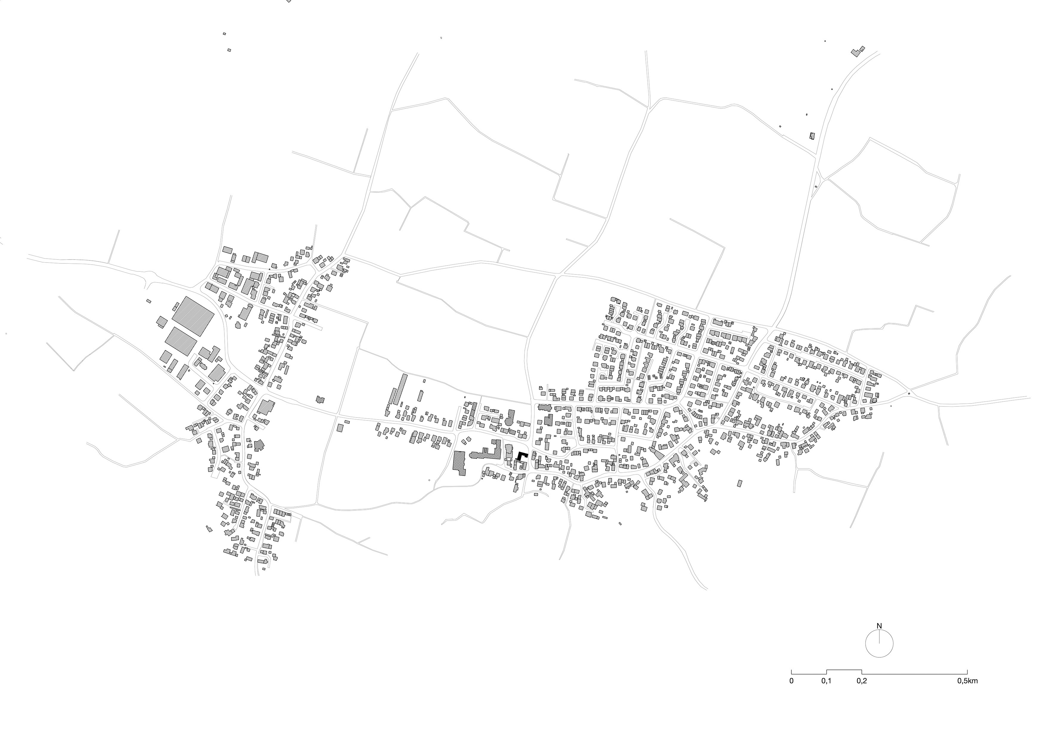
The brief included the creation of an infrastructure that would allow it to be used as a public building, as well as the conversion of the buildings into event and exhibition rooms for three collections from the village: the local history museum; the work of the painter Reiner Strub; and an extensive doll and toy collection of the collector Hiltrud Münker. In order to create a breeding ground for the project, of which would enable the villagers to participate from the very beginning, the actual building project was preceded by a comprehensive participatory process. Over several years, the future use and identity of the Försterhaus was discussed with a working group of committed villagers, and tested on-site through collective activities and public events.
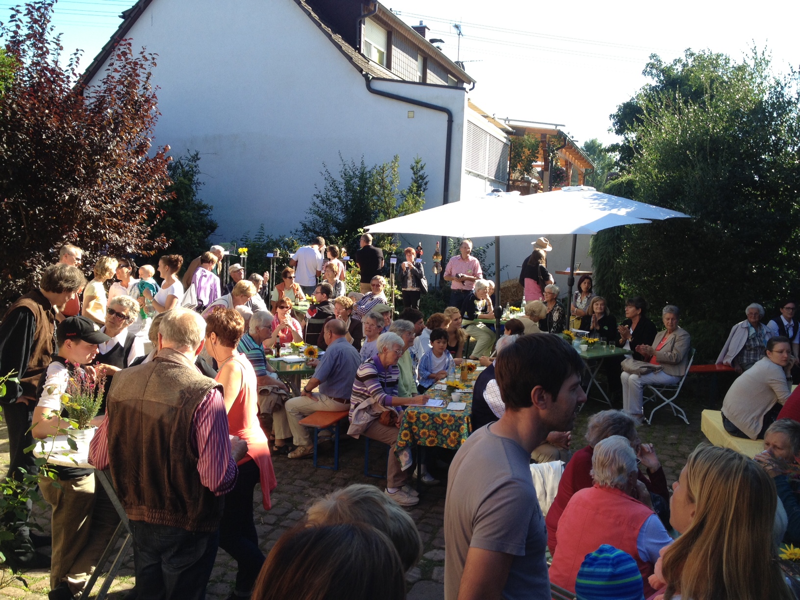
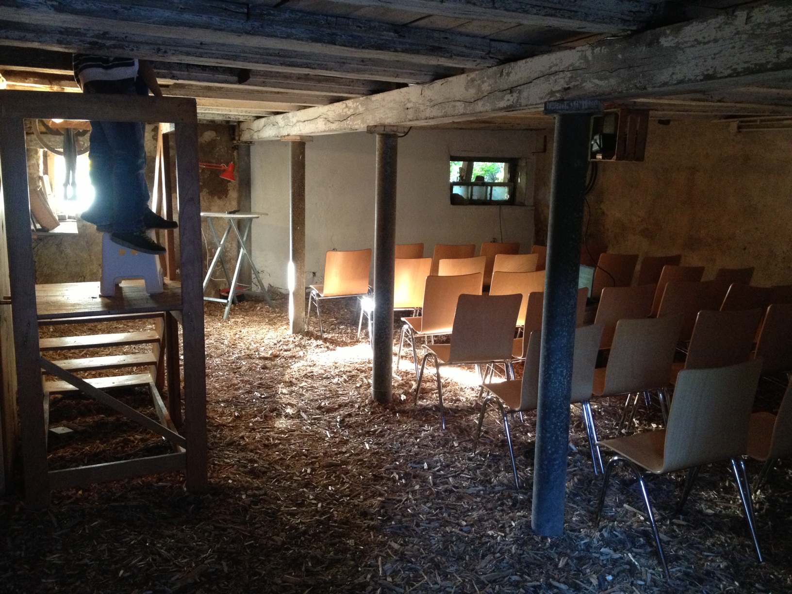
One of the events on the way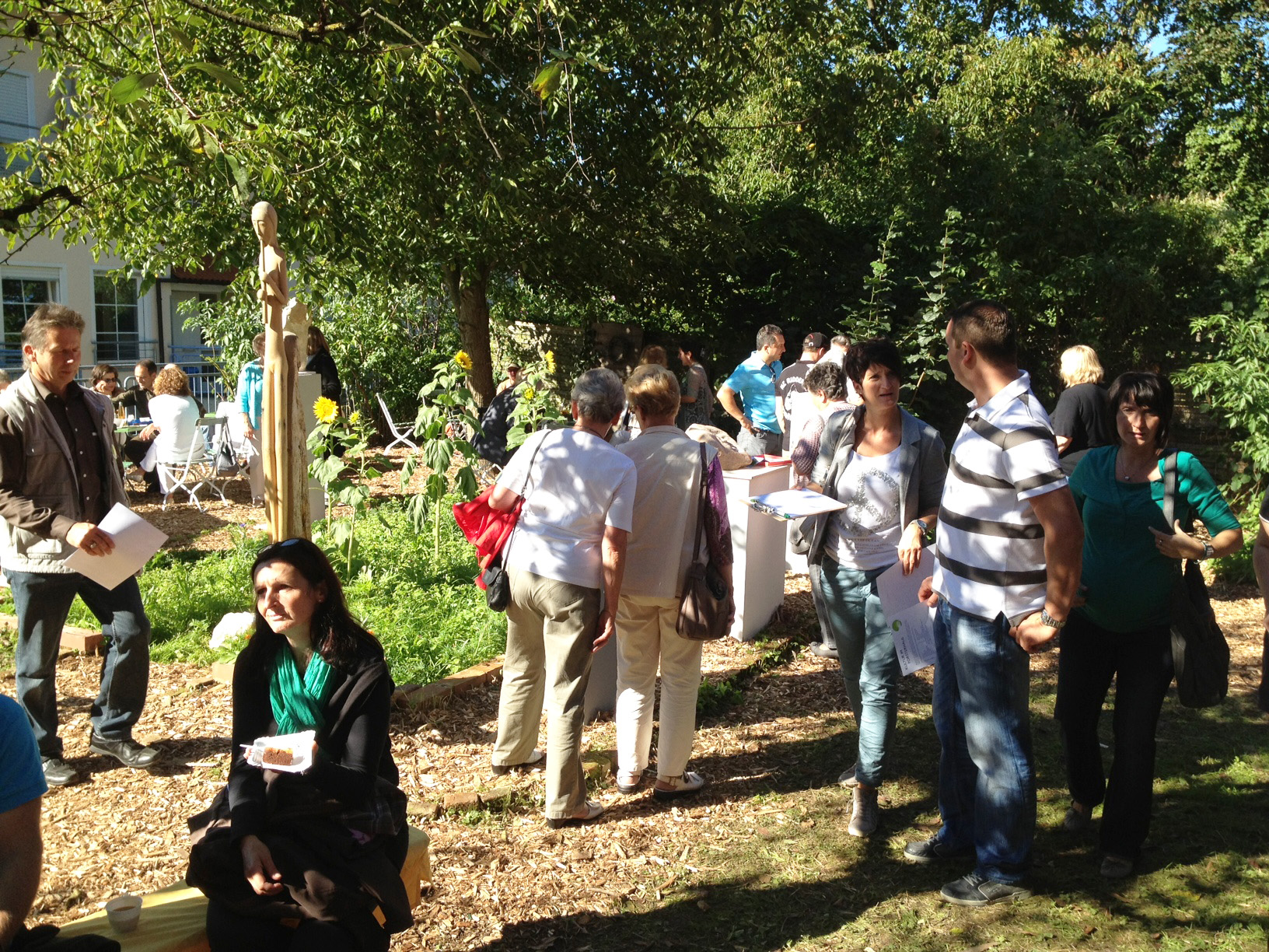
Throughout its history, the existing building had been adapted to changing needs. In particular, a volume embedded in the L-shaped ground plan of the former residential building in the 1960s had greatly changed its expression. The architectural approach was to accept all layers of this conglomerate on an equal footing, and to add a new generation of architectural elements to them.
The open staircase between the contemporary extension of the house and the barn serves as an entrance to the site and connects the upper levels of the buildings with one another. It offers views across the courtyard and into the village, with the town hall and church in sight. The rooms on the ground floor remain directly accessible from the courtyard, as in the days of their agricultural use.
The former residential building now houses the doll and toy collection. The local museum uses the former carriage shed in the historic barn and the upper floor of the tobacco barn. The large space under the roof of the barn is used for art exhibitions. The rest of the ground floor of the barn houses the general premises, including the service facilities and the community room, of which is rented out when there are no other events.
The different ceiling heights above the stables of the barn have been bridged with a new level, while the ceiling beams below have been preserved as a reminder of the former building type. The load of the new floor rests on the existing walls of the barn, and four new columns have been placed in parallel to the former stable walls in the interior.
On the one hand, the materialisation of the project reflects the pragmatism with which the farm successively adapted to the changing needs in the past; and on the other hand, it demonstrates the respect for its representative role in the village, which confirmed its status as a cultural monument in 2009. The structural elements of the new additions are made of in-situ concrete. The surface of the floors has been given a terrazzo finish. The roof of the barn is the only element of the agricultural buildings that has been thermally insulated. It has been covered with an acoustic roof boarding on the inside. The construction of the tobacco barn has been supplemented with raw spruce beams to meet fire protection requirements. The floor, the internal staircase, the all-round railing in this area, and the kitchen in the common room on the ground floor are made of three-ply wood of white fir from the remaining stock of a timber yard in the Black Forest. The balustrades of the stairs in the exterior are made of welded flat steel, of which references the decorative wrought-iron railings traditionally used in the village. Their champagne colour and the large light spheres in the entrance area emphasise the festive character of the area.
The showcases in the doll and toy museum consist of a base constructed from industrial steel loading shelves—powder-coated in grey and dusky pink, and clad by a local carpenter. The exhibition walls that hang in the roof construction of the barn consists ofwhite, varnished three-ply panels that can be taken down for other spatial possibilities. In the museum of local history, individual text panels that are placed between the exhibits help to orientate visitors with information and anecdotes.
A large part of the interior elements were built and installed together with the working group of villagers that had already been involved in the concept phase of the project. They also collaborated in the registration, selection, documentation, and relocation of the exhibits. After the opening, they also assumed the operation of the Försterhaus on their own.
Shelves laid out for assembly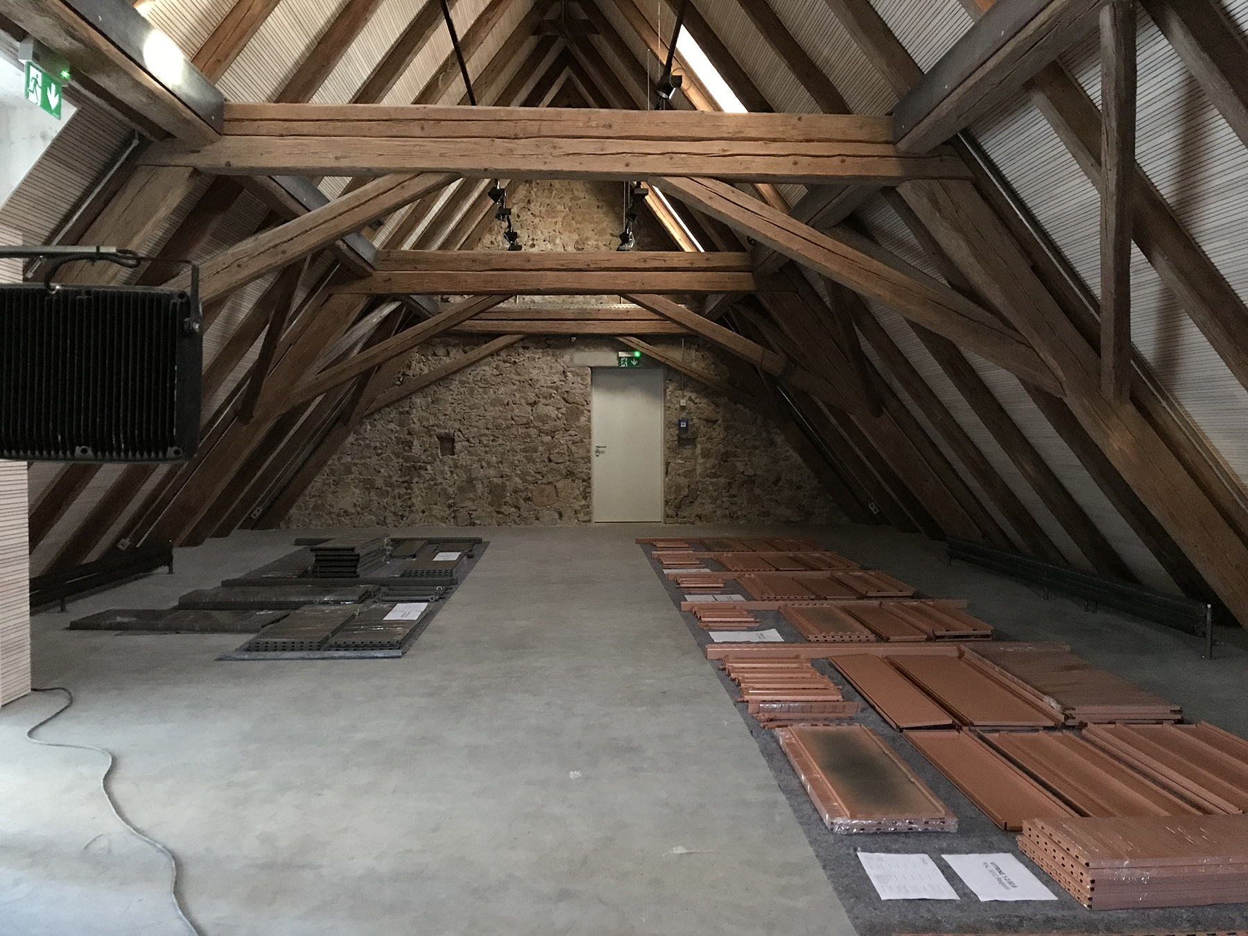
Building the exhibition walls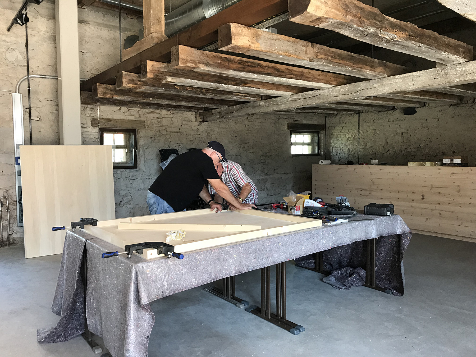
Selecting the exhibits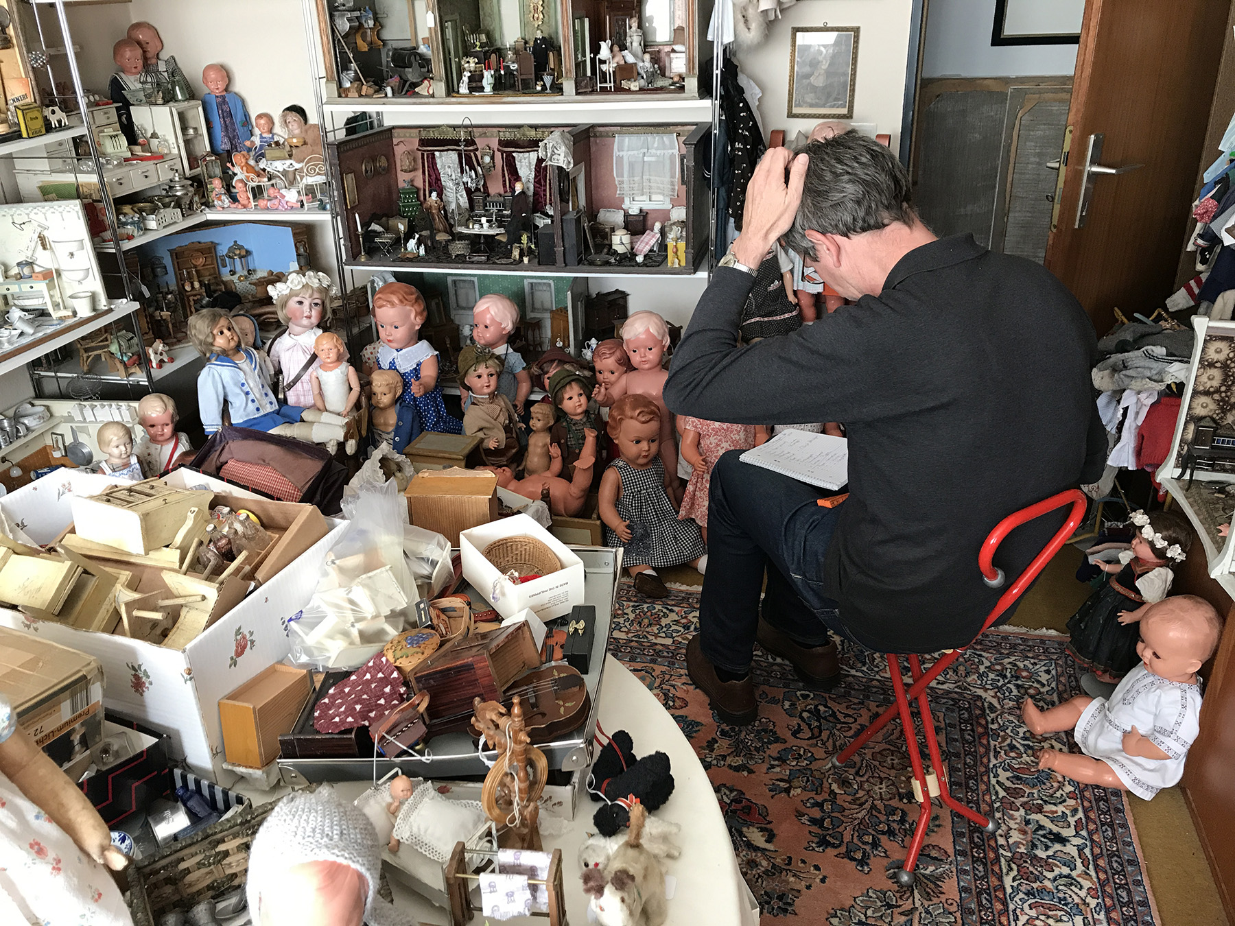
- Related Projects
- Haus Konrad
- Lining a Shed
- Configurations
- Helga Gebert: Märchenbilder
Small Bench
“[...] Like all rooms, the parlour was actually too small for all the furniture that had to fit in it. So the dining table stood directly in front of the folding sofa and on the walls were heavy wooden chests of drawers with rounded corners and ball feet. Next to the faux fur sofa was a small stove where my grandfather burned paper scraps. But first he carefully cut up tea and chocolate boxes into cardboard strips on which he wrote his shopping lists.
Glasses, biscuit boxes and bowls were kept in the "credenza", opposite the dining table. We especially liked the crystal-cut wine glasses, some of which also had little coloured glass stones stuck on them. [...]”
Assembly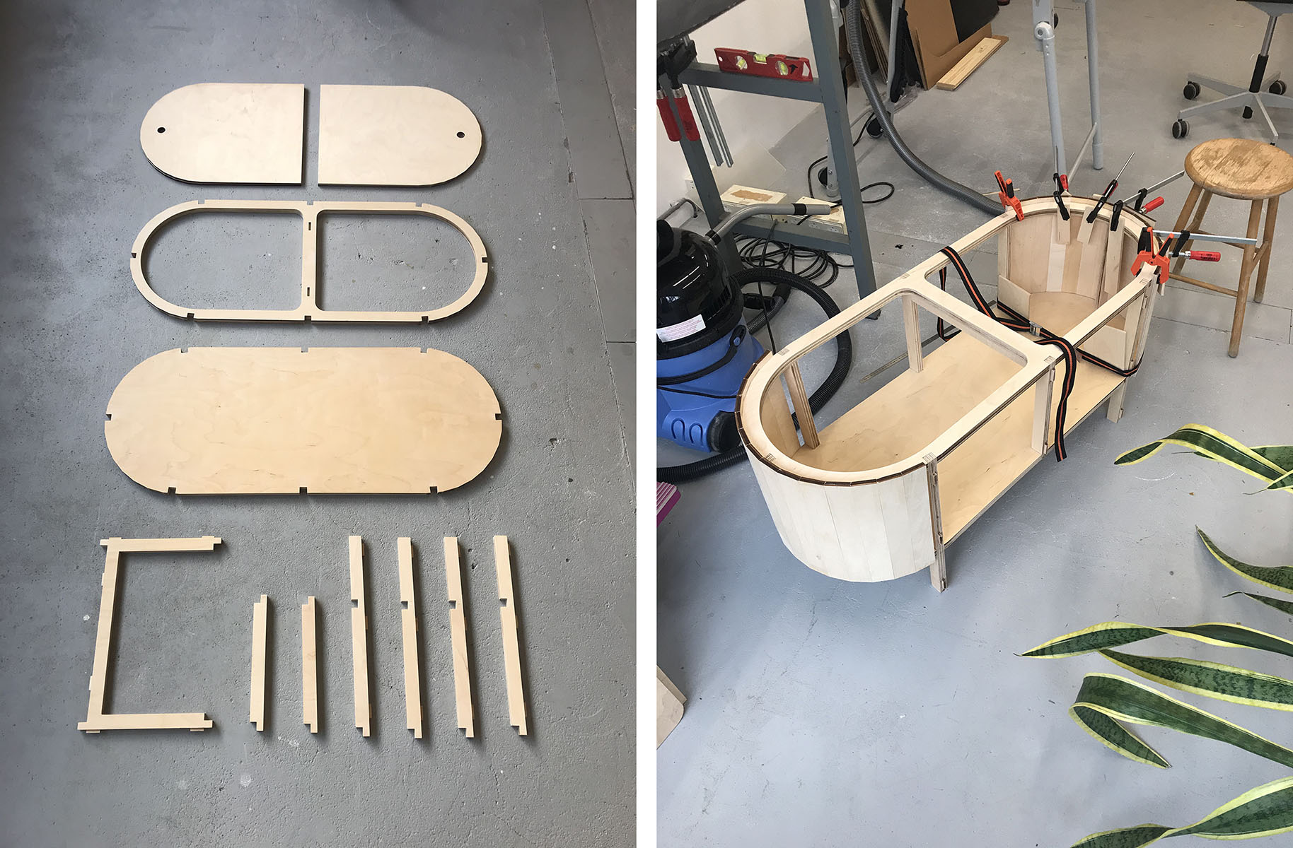
A small bench from the series of somewhat forgotten types of furniture. All parts are made from laser-cut parts of birch plywood and assembled by hand. The top has two hinged lids that give access to the hollow space inside.
- Related Projects
- Dressing table
- The New Craft School
- Small Bench
- Thicket
Dressing table
“[...] When I woke up in the morning, my eyes fell on the wallpaper under the sloping roof. A pattern like drops on the window of a moving train, in brown and light blue.
A crack was visible on the ceiling of the bedroom. During the Second World War, an unexploded bomb fell through the roof and ceiling of the two upper floors and landed in the landlady’s bed. My grandfather and the landlady’s husband courageously threw the dud bomb from the window and into the garden.
During the day, we were not allowed in the bedroom, but we did so in secret nonetheless. The dressing table greatly attracted us. It belonged to a set of bedroom furniture that my grandparents purchased in the 1930s. On the table, my grandmother displayed her soap collection, from which the palette of smells has burnt into my brain; revived from time to time when I pass a drugstore or a group of elderly ladies.
In the hallway, there had been another mirror with a shelf, where my grandfather combed his hair and brushed the lint from his coat before putting on his hat to leave the house. In the car—he drove a white VW Beetle—he then took his hat off again. [...]”
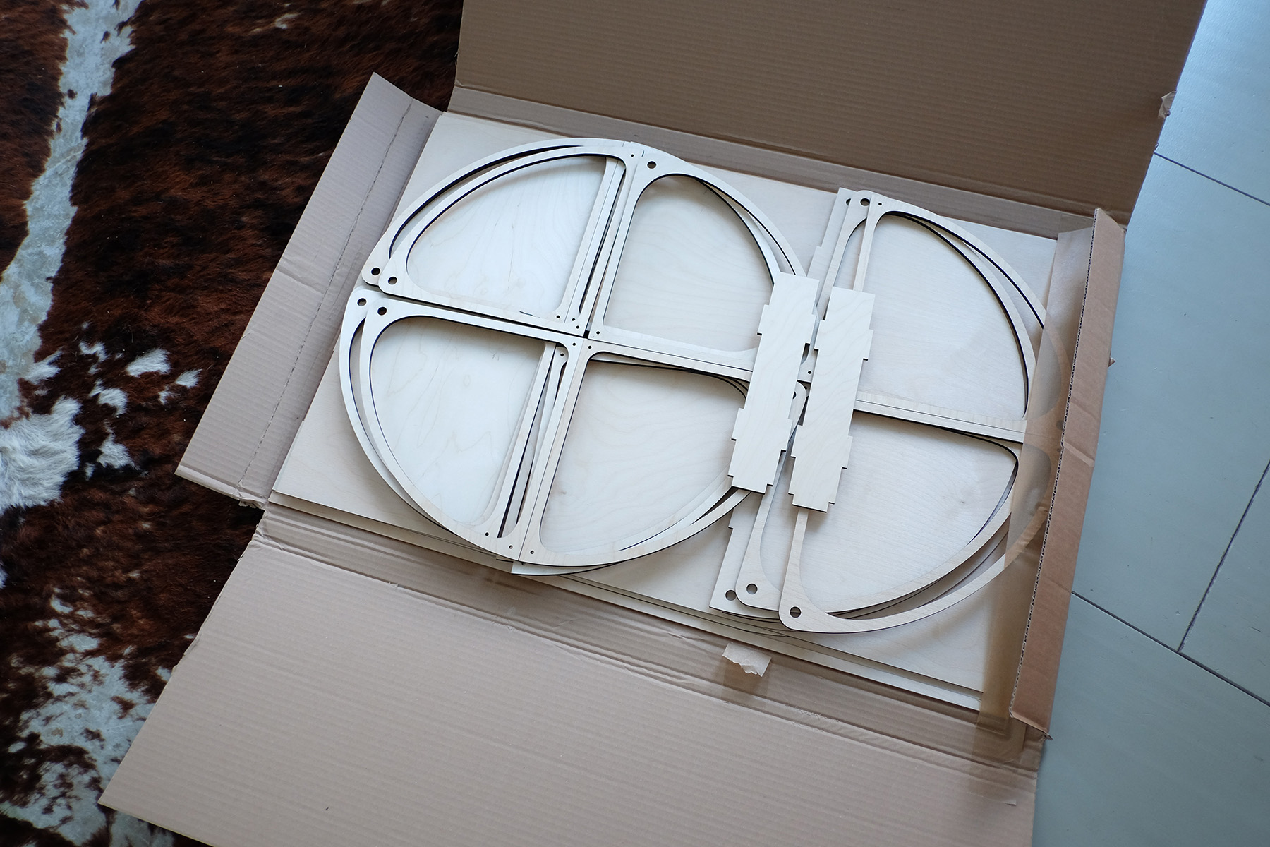
Pre-fabricated parts, manually assembled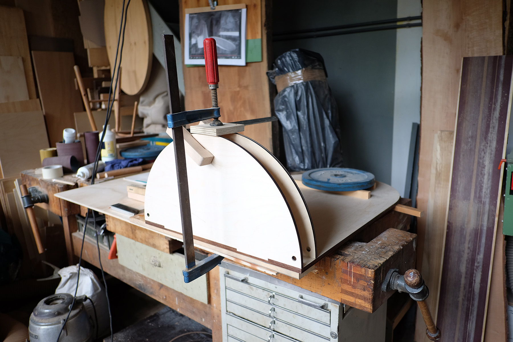
A dressing table, part of a series aimed at interpreting slightly forgotten types of furniture, such as: the escritoire , the folding screen, the dresser, the dressing table…
The dressing table has a back with a simple mirror, a birch plywood body, and two drawers that swing outwards from a brass hinge. All of these components were laser-cut, then assembled and finished by hand.
- Related Projects
- The New Craft School
- Configurations
- Small Bench
- Thicket
Lining a Shed
During a student project at the group Interiors Buildings Cities in TU Delft, students were asked to design the interior lining of part of a former greenhouse now used by ‘De Kas’; a residents’ initiative that works with volunteers to create a small-scale knowledge centre on ecological greenery and water management, surrounded by an educational garden and a nursery. The organisers of ‘De Kas’ needed concepts to transform a part of the greenhouse into a workspace and room for meetings. The lining was intended to create that room, as well as cushion extreme temperatures that persisted under the glass roof.
The students measured the greenhouse in detail, and familiarised themselves with its modular and economic construction. During a workshop with architect Anna Andrich, they developed different approaches to achieve the desired space, which were later discussed and developed further with the members of ‘De Kas’. Finally, under the guidance of the tutors, the group decided on a definitive variant, of which they built 1:1 in collaboration with the ‘De Kas’ volunteers. The room was inaugurated at a ceremony, in which supporters of the initiative were invited.
Workshop with Anna Andrich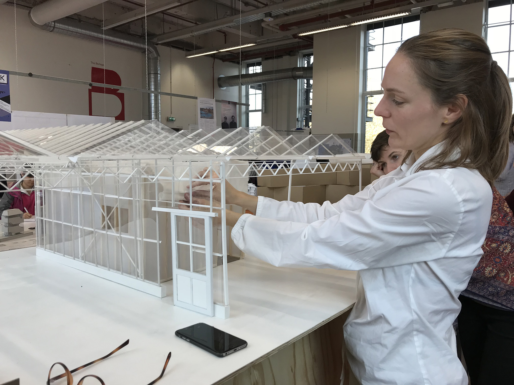
The wooden frame constructed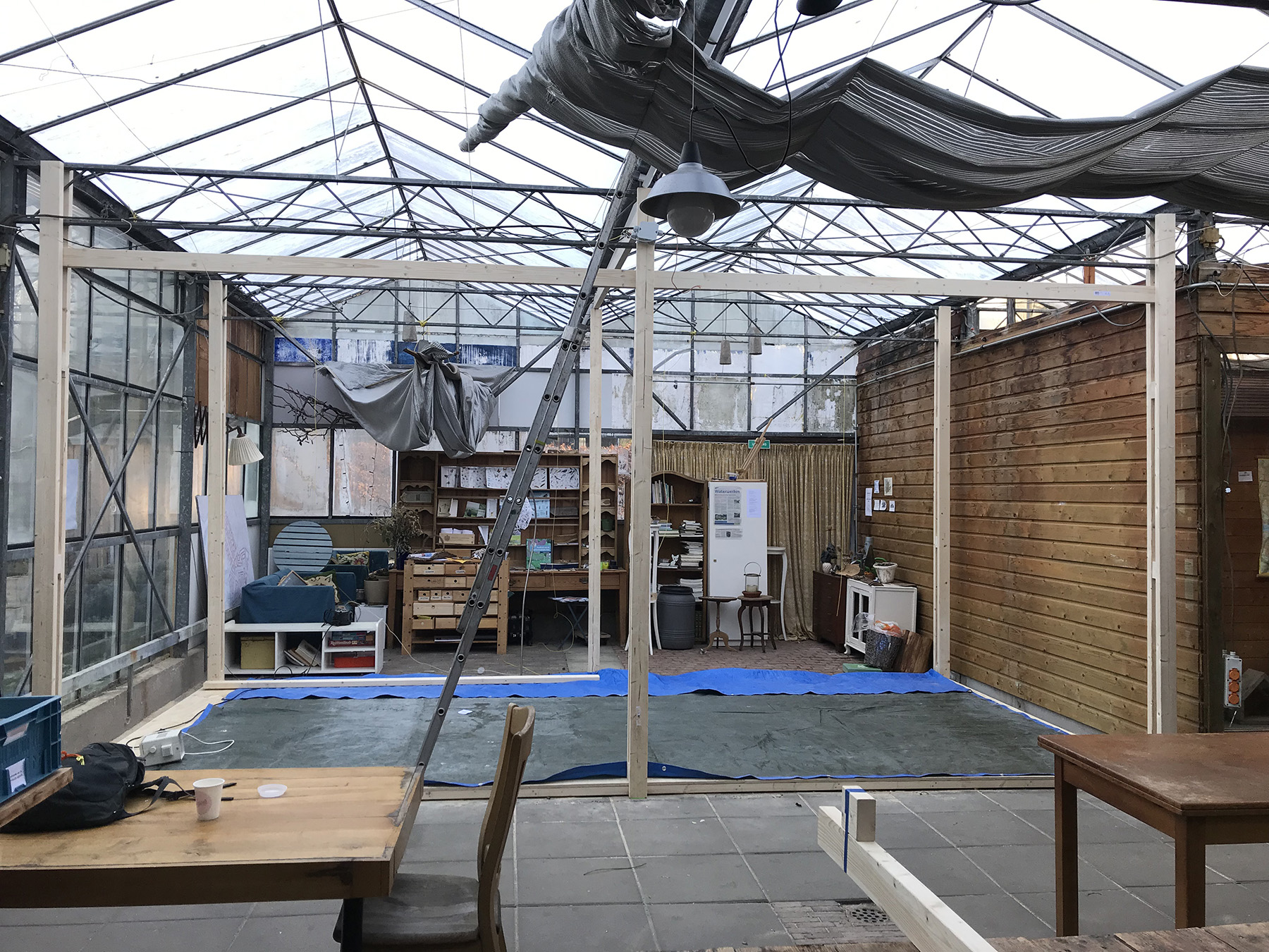
The basic construction of the new space was made with a wooden skeleton that clung from the existing construction of the greenhouse. The walls consisted of different layers of textiles—inside, there were folded moving blankets; outside, reflective foil from the greenhouse construction. Both are second hand. A large sheet of bubble wrap with a layer of reflective foil forms the ceiling. Except for the frieze at the top end, all the fabrics are clamped to the construction or hung over a carrier, so that they can be later removed and used for other purposes.
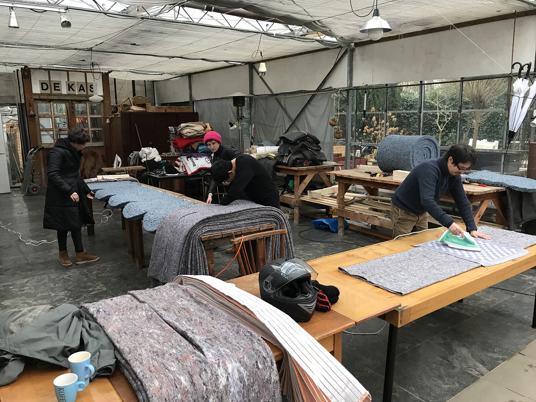
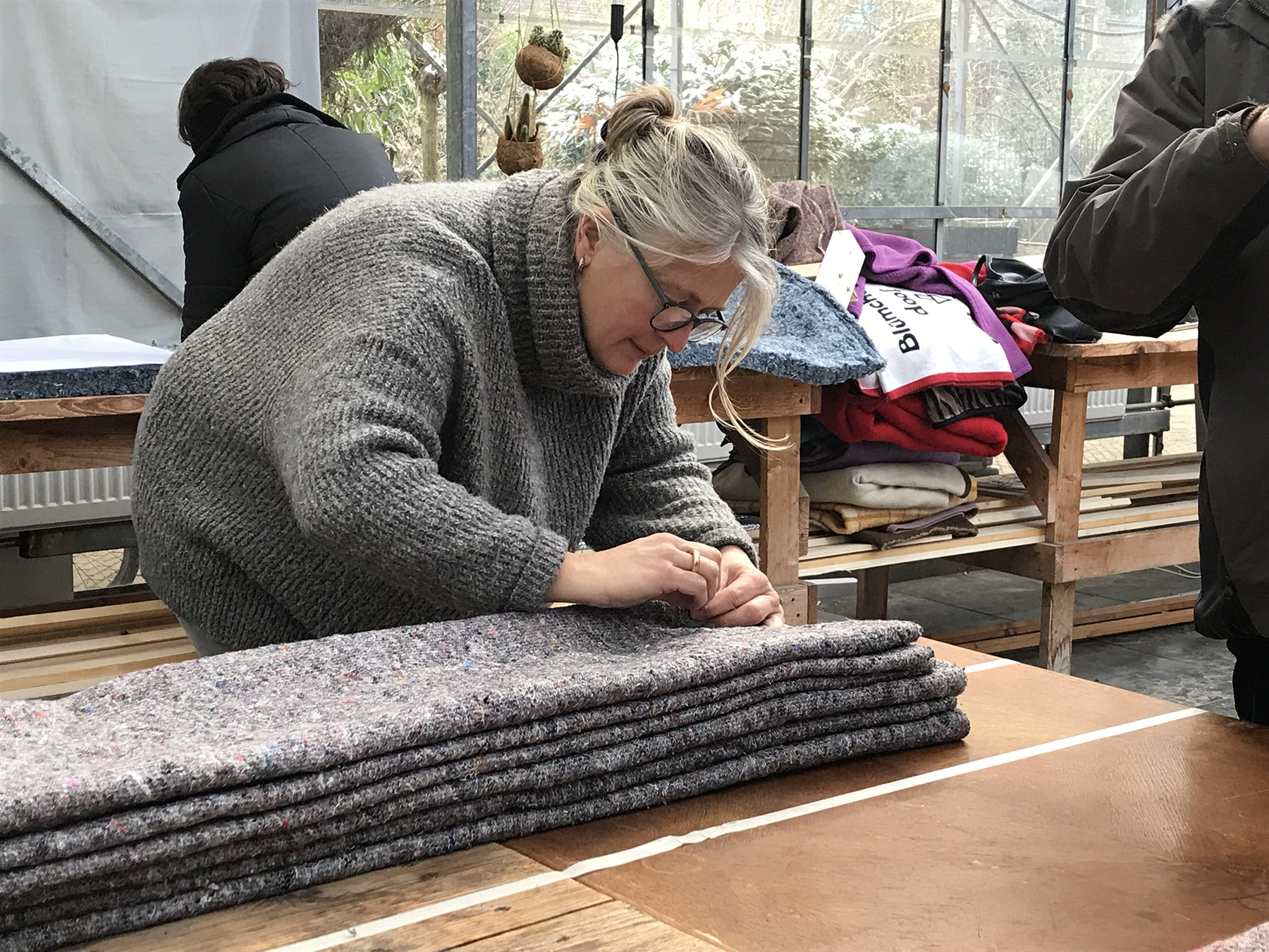
Students and volunteers of ‘De Kas’ 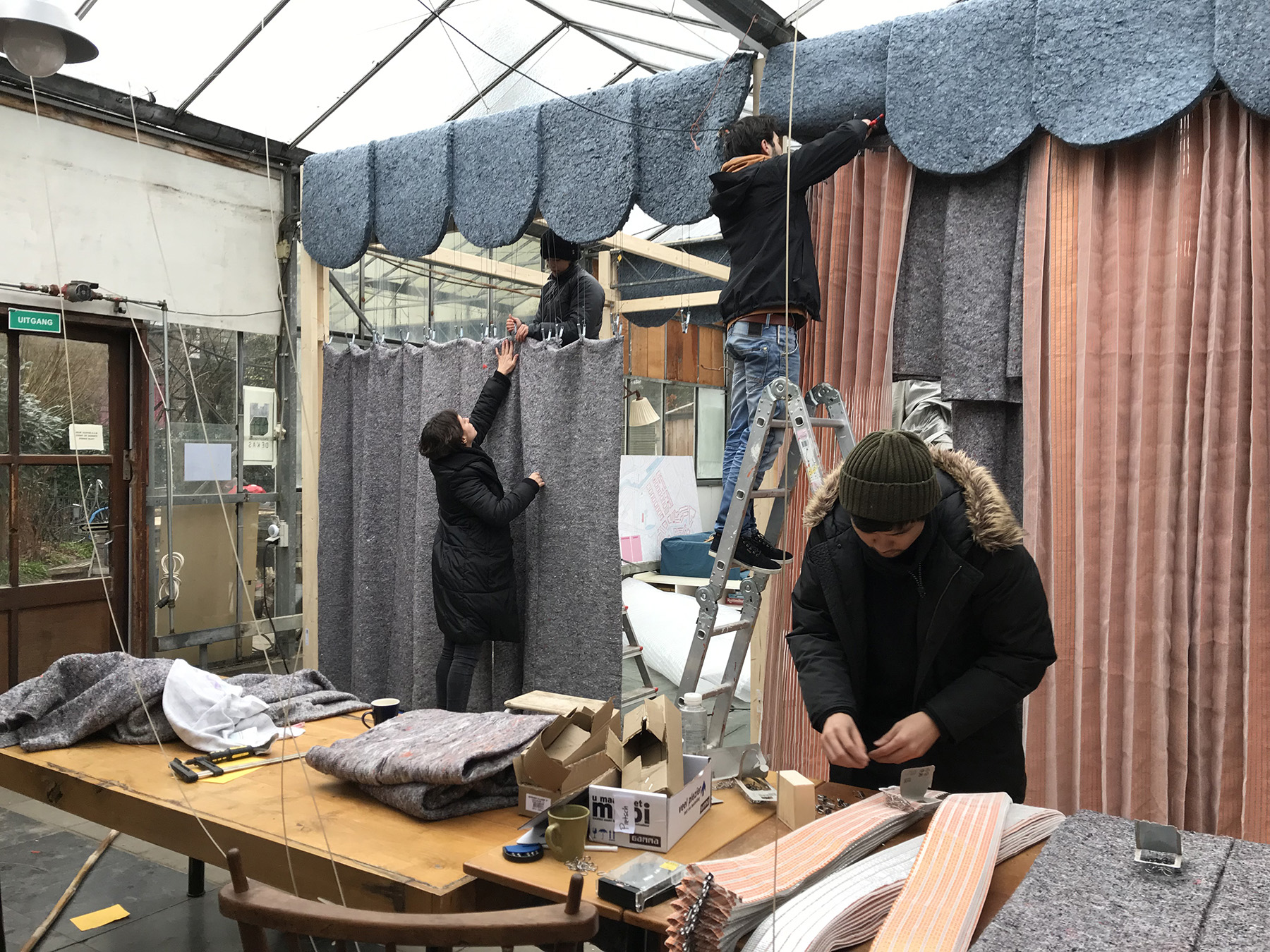
The construction was partly pre-planned and partly improvised according to the properties of the materials found second hand. The construction principles illustrate certain climatic principles—insulation, reflection, absorption—however, the technical performance of the result was limited. In the course of its development, the design developed a festive expression and unexpectedly offered itself as a stage or backdrop for events held in the front space.
- Related Projects
- The New Craft School
- The Air we all Breathe
- Försterhaus Reute
The New Craft School
In 2014, the Creative Industries Fund NL issued a research call for designers, with the aim of being part of the discussion on the future of the Dutch vocational institute. As a team of architects and architecture historians, we proposed a study called ‘The New Craft School’. This title was a statement that pointed towards our interests and motivations. In practice, our architectural work depends entirely on craftspeople who are skilled and —in the sociologist Richard Sennett’s definition of good craftsmanship—have “the basic human impulse to do a job well for its own sake”. As teachers in architecture, we recognise for ourselves the notion of educating a craft that requires—to quote Sennett yet again—“being focussed on acquiring professional skills”. Therefore, our research has been concentrated on the role that architecture can play not only in designing new schools, but in creating environments in which students are motivated to become ‘good craftspeople’.
We think that the architecture of vocational schools help to foster and showcase cultures of craft, to later integrate them into society. However, within its discourse it is crucial to expand upon the notion of architectural design itself—as the creation of an environment, a context in which social relations are negotiated, and where culture materialises. To design a school is to give shape to buildings, but also to the communities of its users and to the environment in which a school is embedded. It is a collaboration between the client, the users who inform the craft culture and who best understand the identity of the school, and the architect who translates ideas and aspirations into form.
The book puts the Dutch vocational school forward as a specific architectural project. One the one hand, this entails knowledge of its local history and evolution; and on the other, comparisons with cases in other contexts. It also acknowledges that the craft school is never an institute that stands on its own, and that the essential impact for craft culture is at times not delivered by the school itself, but by another figure in its network.
At the heart of the publication, 26 best practices are depicted: historical and contemporary; vocational schools and other institutes related to the vocational, built and imagined; new and reused; Dutch and from abroad. Their shared architectural agenda is a conscious representation of vocational cultures. In order to make them comparable, we combined both a historical and architectural reading of the projects. The historical reading captures the buildings in their context, time, and intention. The architectural reading describes their autonomous architectural merits. The result is a cross-cultural and cross-historical archive of ideas that can serve as models; not to copy, but to inspire and build on, to create a new chapter in the history of the craft school. After all, their cultural value has led to outspoken, characterful buildings that have countered the blandness of the Dutch school production of the last twenty years. With this, they represent a specific kind of sustainability: offering qualities that keep buildings valuable over time and create pleasant and stimulating environments.
For the visual representation of the buildings, we chose architectural drawings that depicted the buildings in their surroundings and selected images that depicted contemporary projects as places of the everyday rather than curated architectural objects. The pictures consisted of stills from films that we made during our visits. To transform the concept of our films onto paper, graphic designers Sandra Kassenaar and David Bennewith superimposed several successive stills to highlight life in and around the buildings. Instead of conceiving the physical form of the book merely as a medium to transmit information, Sandra and David proposed to supplement the book-object itself by customising paper for it. This paper was made by Schut Papier, a paper mill in Heelsum. It was based on reinterpreted samples—selected from the mill’s archive—of an industrial filtration paper from 1947 and various security papers the mill had produced over the years.
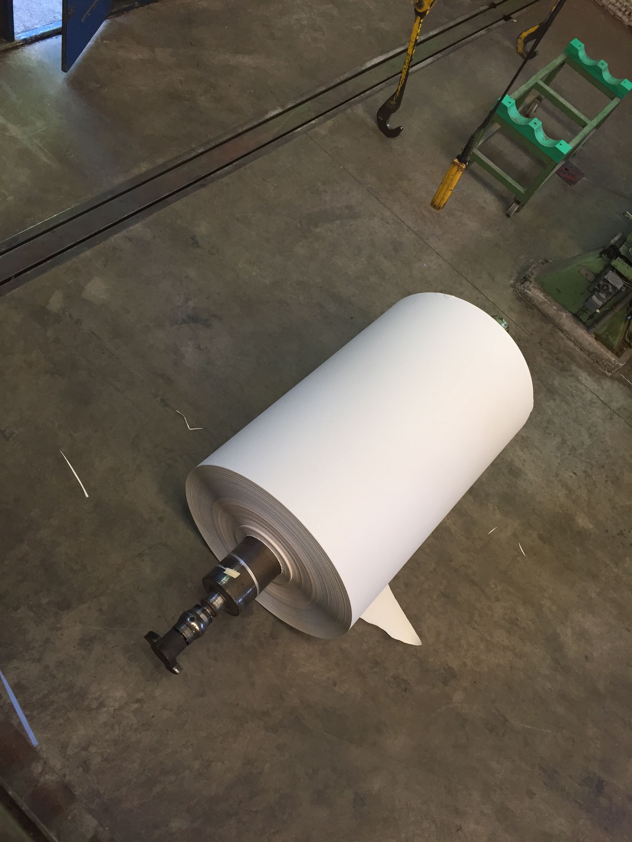
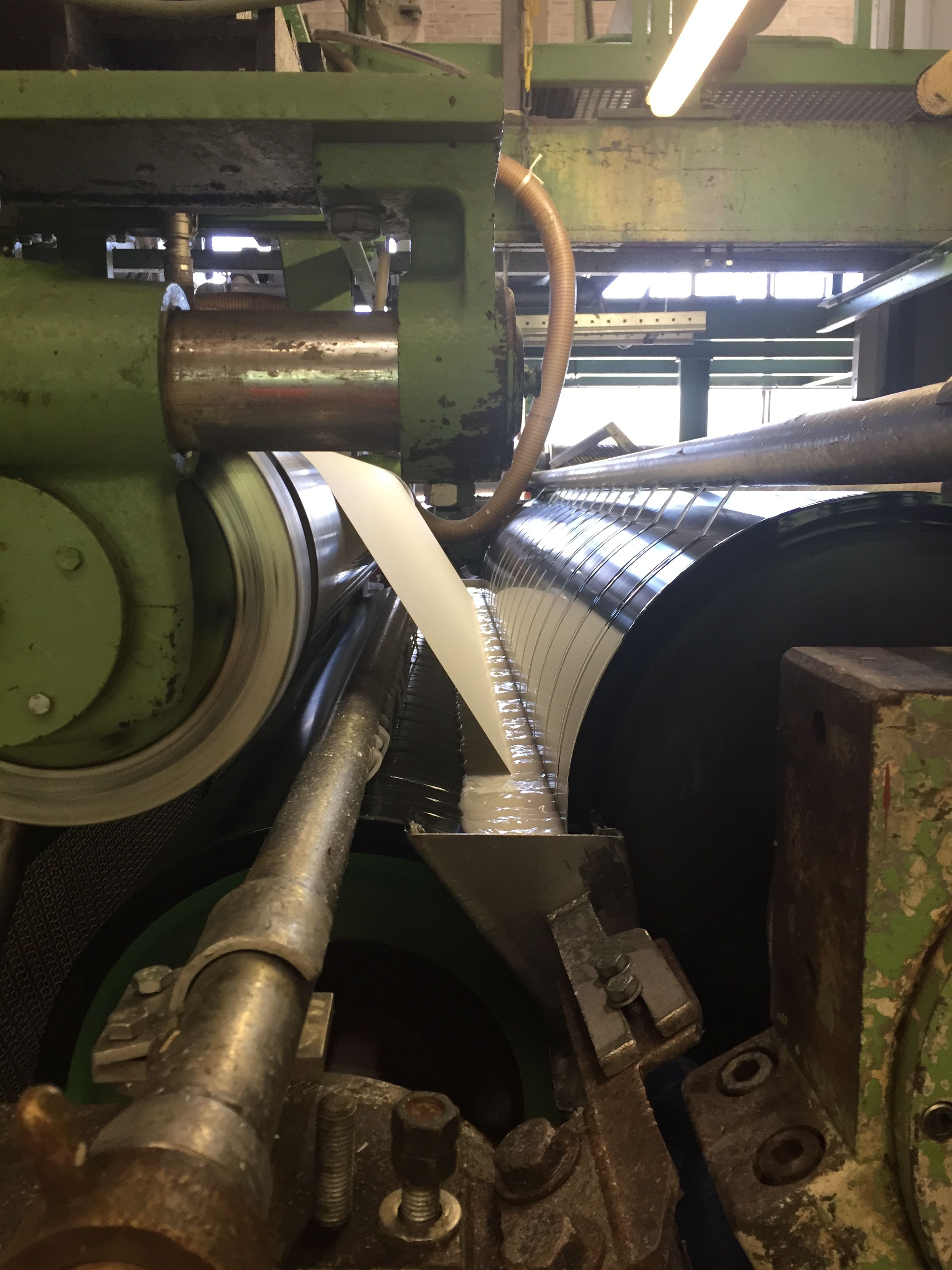
Paper making at Schut Papier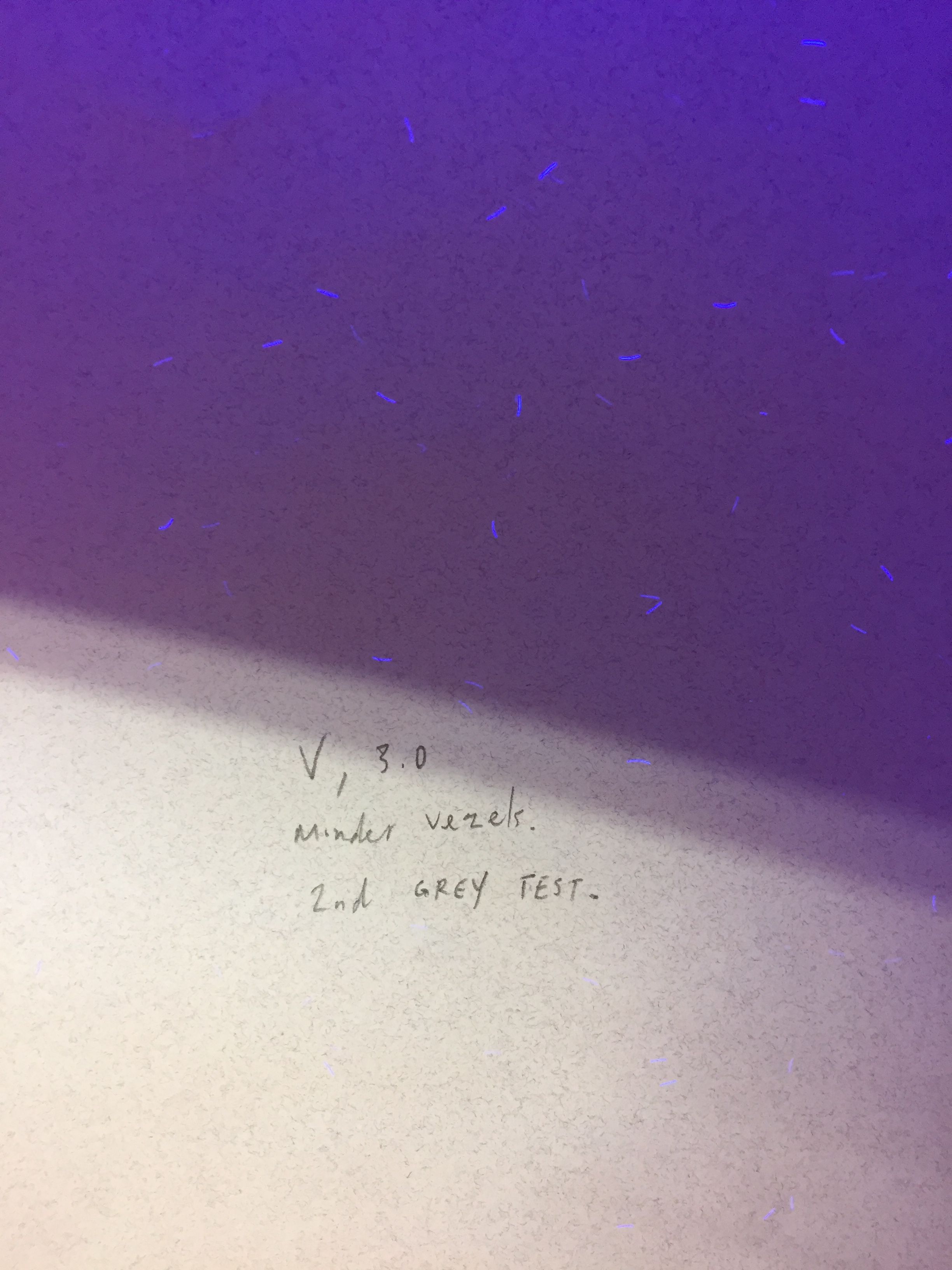
- Related Projects
- Walls that Teach
- Lining a Shed
- Dressing table
Configurations
Compositions that can also act as spatial plans. Like architectural plans, they can be understood as representations of spatial sequences for some, but opaque lines and forms for others. They imply possible internal logics, construction principles, and other cultural or social formations. Gradually created, they reflect impressions from projects, excursions, books, and discussions with students or fellow architects.
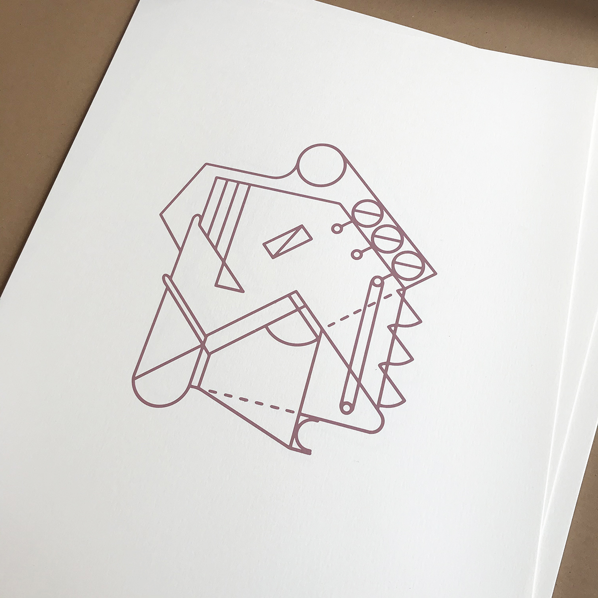
Screenprints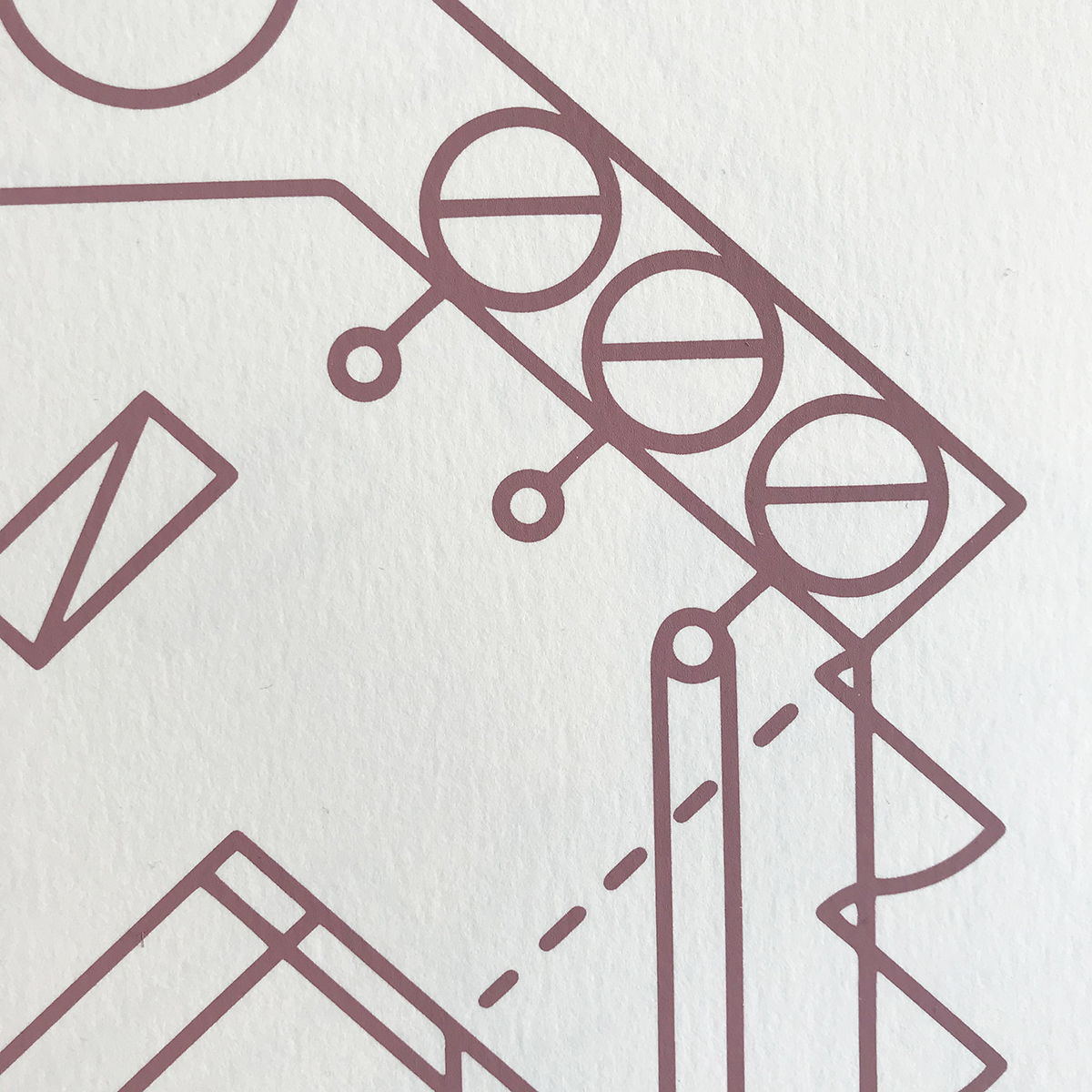
- Related Projects
- Dressing table
- Försterhaus Reute
- The Demon of Comparison
Walls that Teach
“In this house the walls will teach,” declared the Soviet news agency Pravda at the inauguration of the Moscow Palace of Young Pioneers in 1962. This statement casually formulates what has become a recurring motif in the history of architecture for the young: the claim to educate through built environment. Young people were considered ideal targets for this approach of social constructivism because of their status of ambivalence: objects of social rights, but not yet subjects of political rights. The organisation of youth centres around leisure activities partially concealed their educational goals, and consequently led to them being all the more pervasive. The pedagogical power of their architecture is found not only in their design, but also in the modes of its usage, appropriation, and inhabitation.
Containing 14 essays and 25 case studies, this book traces the ideological manifestations that have surrounded the pedagogical architecture of youth centres throughout the 20th century.
- Related Projects
- Group Affinity
- The New Craft School
Foyer Goethe Institut
The Goethe Institute in Rotterdam is located on the Mauritssingel 9, behind a historic façade dating back to 1872. When the institute moved to this location in 1998, the building behind the historic façade was entirely replaced to meet the needs of its new users. In accordance with the way the Institute operated at the time, it presented itself as a house where visitors were received at the entrance and were directed to the various areas of the building. Through an entrance door located deep in the façade, one could reach the hall, and from there the library, the rear areas with a room for events, and the staircase on the upper floors with classrooms for language courses, the offices, and a former caretaker’s flat. The latter is now used for architects and artists in residence. In front of the hall and with a view to the street was the mailroom; now used as a server room.
Because the organisation had changed over time, the intention was to present itself as an open public facility, but the floor plan limited this. The public areas of the building were dispersed, and the way to these different rooms was difficult to find without guidance. The common rooms were uninviting, and the possibilities for the institute to display its activities to the outside world were minimal.
It was assumed that structural changes would not be possible within a reasonable period of time, due to required feedback and approval procedures. Therefore, the approach was to create an installation that would overlay the existing building and make it easier for the public to use without fundamentally affecting it.
This included the conversion of the mailroom into a display case, a new reception desk that would also enable a more open connection to the library, an information wall where the distributed areas throughout the building could present themselves in a uniform manner, a new orientation system, an intervention in the long corridor that led visitors to the rear areas in a pleasant way, and a new interior for the space in front of the event room that developed into the most important public space in the building; the foyer. The language students spend their breaks here; it has been used as a reading area by the library; and as a room for speeches and drinks at openings or concerts.
Concept for the entire public area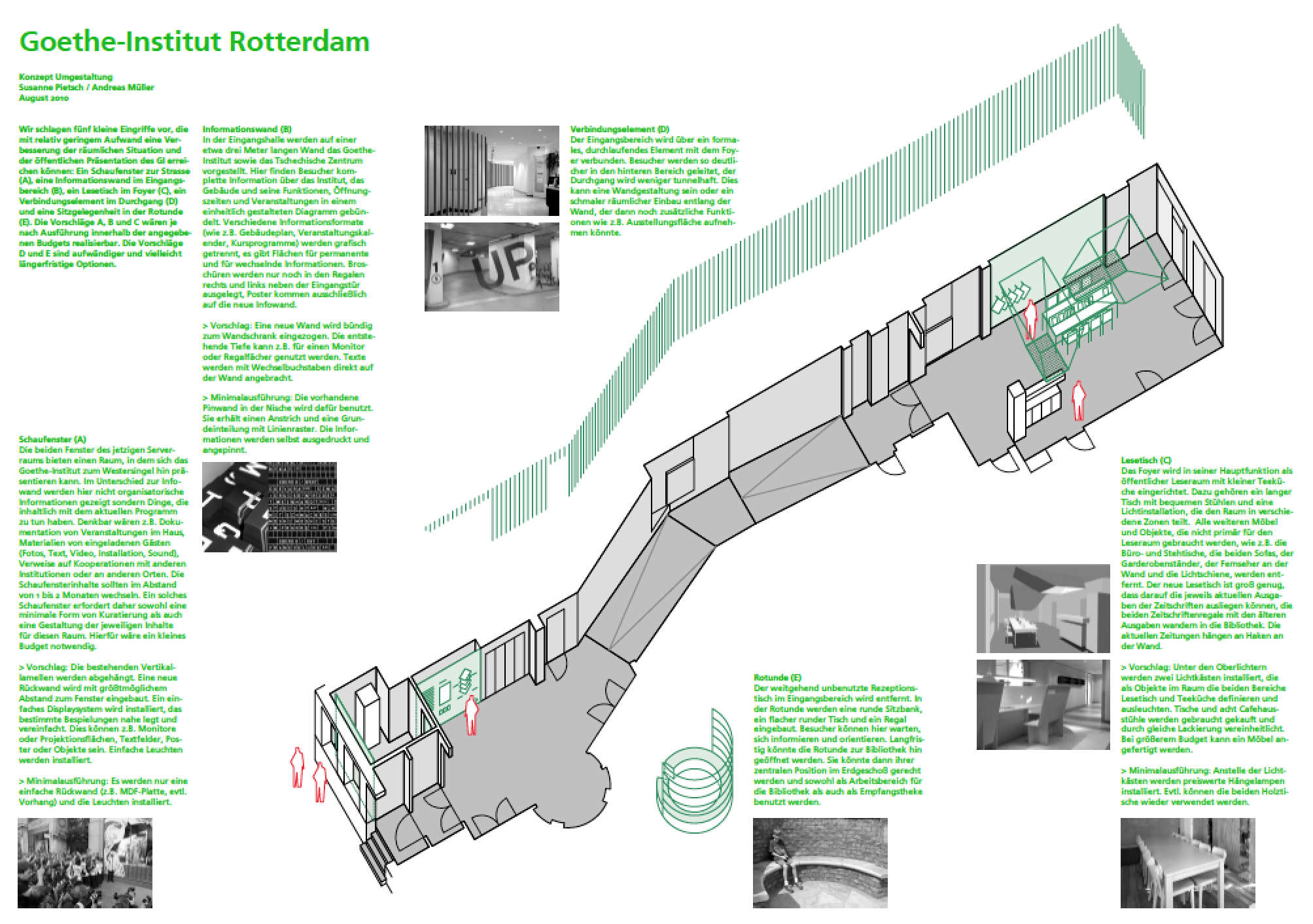
From this proposal, two interventions have been provisionally realised from a minimal available budget: the display case and the interior of the foyer.
The windows of the façade in the former mailroom were extended with a box that has removable back panels; deep enough to present work produced by the architects and artists in residence for the public on the street.
For the foyer, a wall of vertical wooden slats was designed, into which the magazine racks with storage compartments, a hanging facility for newspapers, and the cloakroom were integrated. There is a simple table placed in front of it. For the lighting, the original plan was to modify the roof lights—the only source of light in the room—and complement them with artificial lighting, but this was unrealised. Three large lamps that add a domestic aspect to the room were installed instead.
- Related Projects
- The Demon of Comparison
- Architecture Institute Rotterdam
Oosterpark Amsterdam
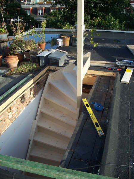
The starting point for this project was the owners’ desire to add an outdoor space to their apartment; situated in the two top floors of a house from 1885 in Oosterpark, Amsterdam. Since purchasing the apartment, the prospect of being able to use the house’s roof as a garden had been an important consideration. The garden should be as large as possible, and directly accessible from the inside. However, because the house was part of a protected townscape, the extension was not to be visible from the ground, especially from the street side. Therefore, the extension was designed as a room in the middle of the roof, with a garden terrace on either side. The façade of the room faces the two terraces, and consists of glass doors that can be folded away; enabling the room to remain continuous from inside to outside. On the sides towards the neighbours, the new interior is bordered by two closed elements that house the stairs and large built-in cupboards. The boiler, washing machine, and dryer were also moved here from the bathroom below.
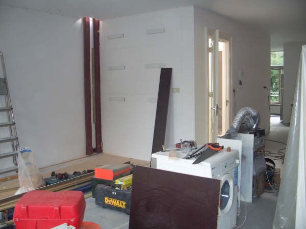
Prefab elements arriving on-site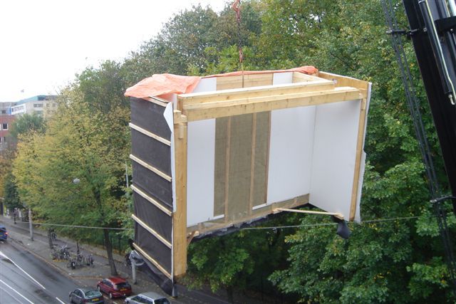
The weight of the extension was transferred by the means of steel beams on the building’s two firewalls. Not uncommon for a building from this period, these walls were tapered on the upper floor, so an additional steel structure had to be installed to carry the load. The only other perforation in the roof was for the stair opening. The new staircase was modelled after the existing staircase in the house for a seamless transition throughout. Above the stairs, there is a skylight from which no details are visible from the inside, giving the user an impression of being outside. The interior of the entire extension is painted white to reflect the light.
The outside of the building and the planters are clad with red cedar wood; the railings are of galvanised steel. To save on weight, the garden is laid out in planters on a layer of substrate and foam. The planters contain a watering system, and lower-half drawers for garden tools. Strict sight-lines meant that the front of the roof could not be used, so flower meadow was planted there instead, which saw the trees of Oosterpark being used as a backdrop.
- Related Projects
- Haus Konrad
- Foyer Goethe Institut
Haus Konrad
Haus Konrad is a house for a retired couple. The purchase of the site was accompanied with an approved building permit, which specified the position of the future building, its external dimensions, and its roof pitch. The volumetry of the house was based closely on these specifications, maximising them. On the entrance façade, the roof reaches almost to eye-level, while the garden façade has three storeys. These storeys are stacked into the triangular shape of the interior and interconnect through a void. From certain angles, one can look through the entire house. Only the bathrooms, a utility room, and the bedrooms are enclosed spaces.
The garden facade is partially clad with solar panels, and a rainwater cistern is dug into the garden to feed grey water into the sanitary network. Balconies serve as sun protection. Inside, built-in elements in various shades of green provide the rooms with storage space.
Bookshelves separating the bedroom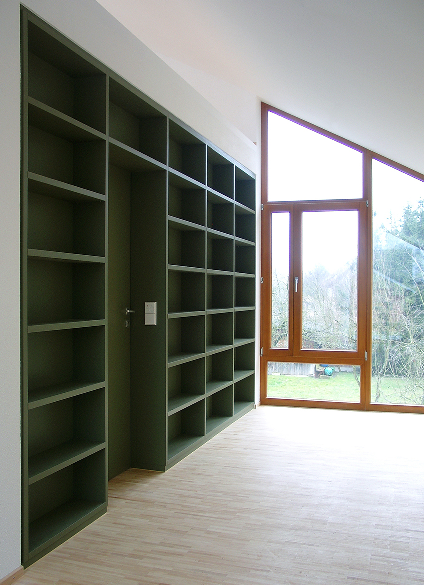
Interior of the study in the dormer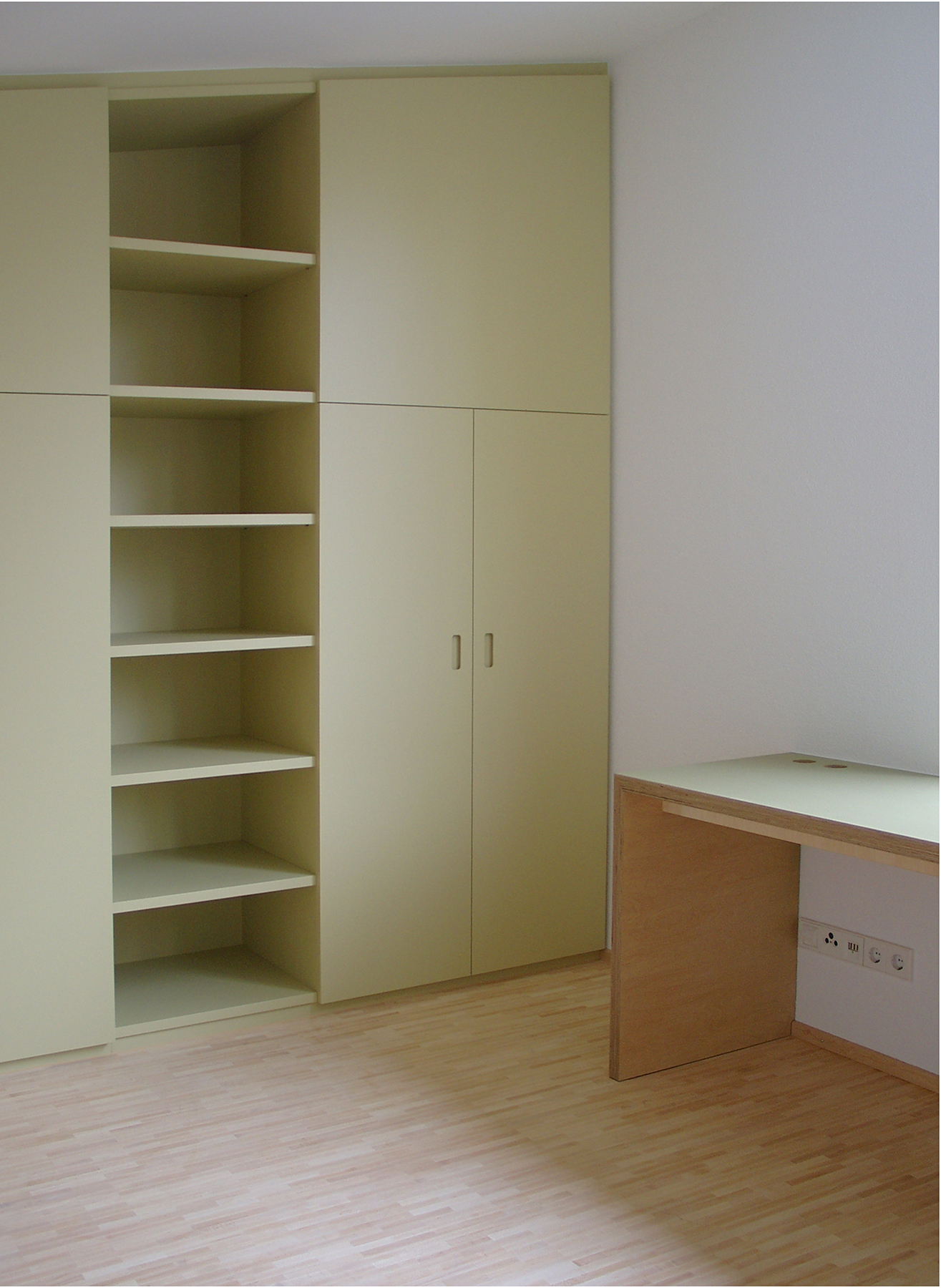
The house is built from hollow block bricks, complemented with a wooden structure for the roof, the garden facade, and the large dormer; and covered with a thermal insulation composite system.
- Related Projects
- Oosterpark Amsterdam
- Försterhaus Reute
Group Affinity
“Group Affinity” was a two-week summer school that took place in Munich in August 2011 and was organised by Kunstverein München and Casco-Office for Art, Design and Theory.
Conceived as an experimental educational project, Group Affinity referred to earlier initiatives of the Kunstverein München on the topic of ‘self-organisation’ in the 1970s and 90s. The concept of ‘affinity’ became a core concept to examine independently governed cultural production in a time of increasing neoliberal influence on European cultural policy and education.
Five independent collectives—Andreas Müller and Susanne Pietsch, Chicago Boys, Cinenova, Grand Openings as well as Slavs and Tatars—were invited to each propose a faculty for the summer school. Referring to their own self-organised practice, current research and work processes, they implemented the curriculum for the participants selected from an open call for proposals.
Youth Centre München-Pasing 1967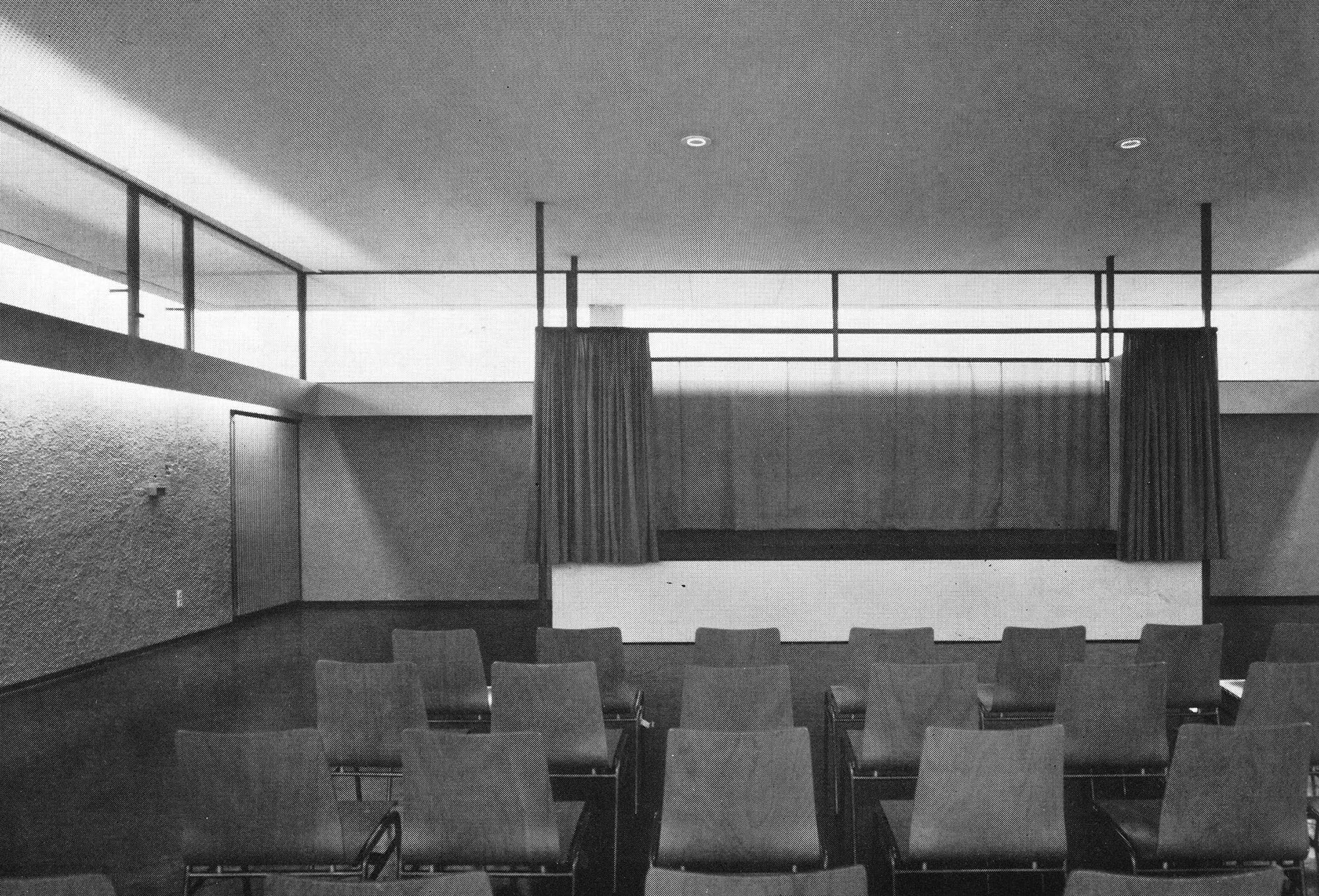
Youth Centre München-Pasing 2011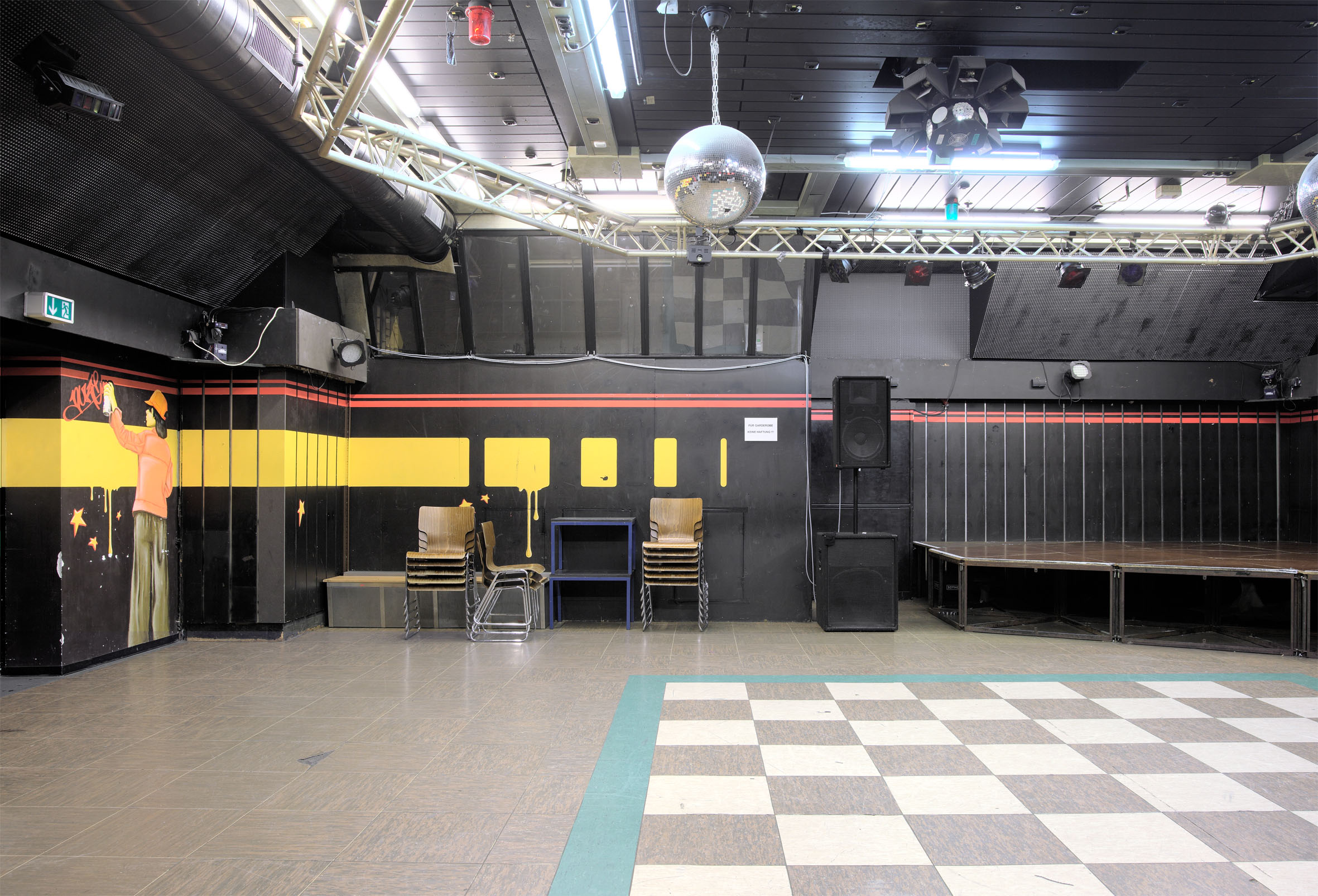
The collaboration with Andreas Müller was based on the conviction that the critical analysis of spatial relationships and the visualisation of their socio-political conceptions can offer an opportunity for political action. Within the framework of the research project on youth architecture, which resulted in the publication Walls that Teach, we were examining youth centres with regard to their design, the way they are used, appropriated and adapted.
Following the example of the Aqu@rium youth centre in Munich, which was built in the 1960s and has since been completely reshaped by its users, the members of the faculty were asked to form a temporary research group with the aim of developing an own imaginary youth centre.
- Related Projects
- Walls that Teach
The Demon of Comparison
"[...] 'The Demon of Comparisons' is an association of subjective positions relating in various ways to larger social and political frameworks, to power and cultural constructions. Persisting on the issue of individual agency in a landscape defined by questions of national and cultural identities, 'The Demon of Comparisons' questions the kind of collectivity these subjects can form.
The title is a translation of a phrase from Jose Rizal's novel 'Noli Me Tangere', 'el demonio de las comparaciones', used by Benedict Anderson as the title of his book, under the rendering of 'The Specter of Comparisons'. An original and insightful thinker, Benedict Anderson questioned the patterns and the meeting points that are to be found throughout geographies, times and power structures that lead to formations of identities and various senses of belonging. Our translation remains anchored in this area of interest, but wishes to add the potential of the polisemy, indeed the spectres, of the original Spanish word, 'demonio', in dealing with the subjectivity of one's experience of culture and power.
'The Demon of Comparisons' grew out of the exchanges and discussions during the 'Open Circuit #1: Yogyakarta', organized by Electric Palm Tree in September 2008 in Indonesia. During the week-long workshop, participants shared and negotiated their experiences and vocabularies of social transformation from their respective backgrounds.
The exhibition is in a dialogue with 'The Antagonistic Link' running at Casco, Utrecht throughout the same period. "
Plan SMBA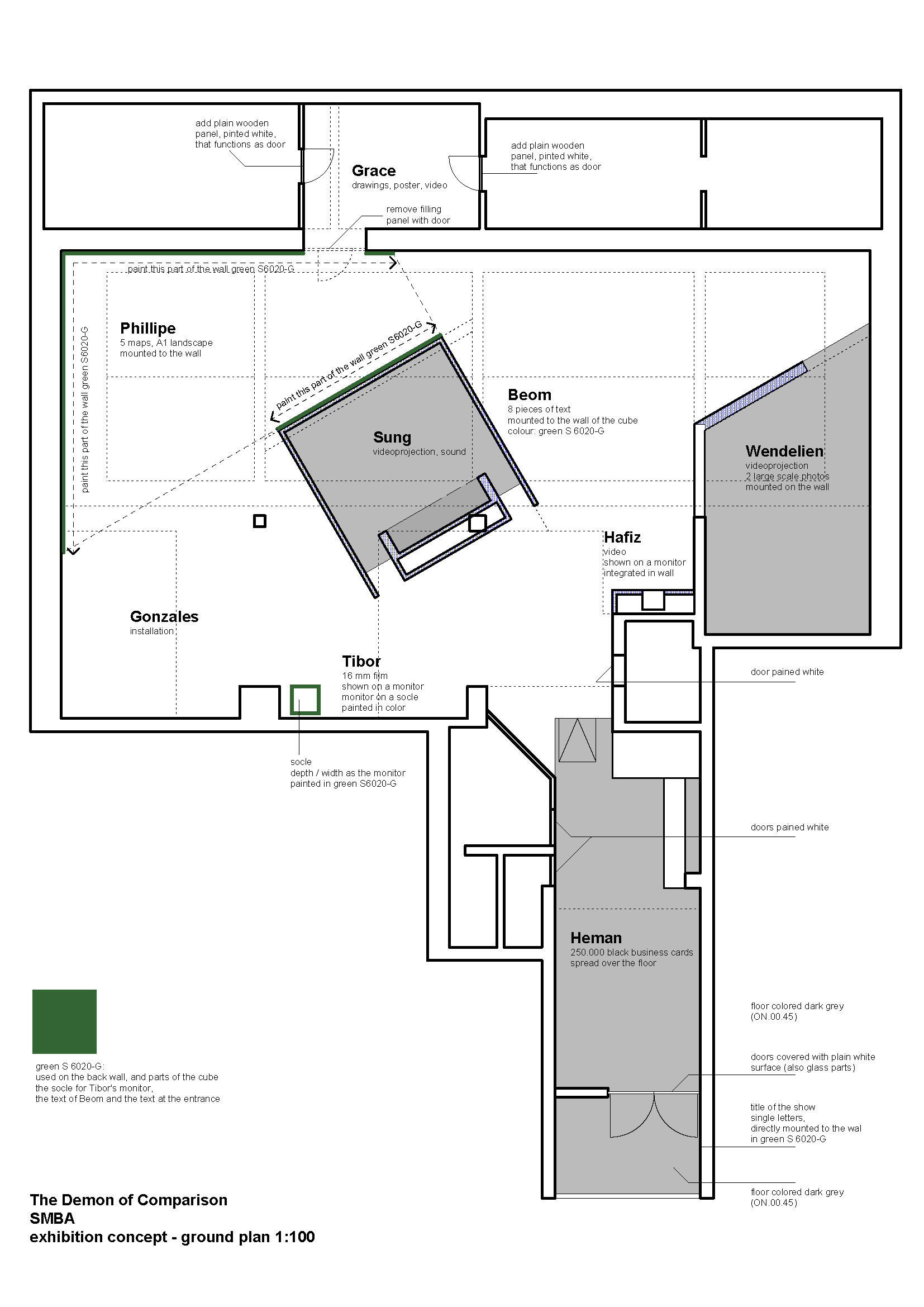
The design of the exposition divides the space of the Stedelijk Museum Bureau Amsterdam into different zones and reunites them through the directions and proportions of the inscribed spatial figures: a central, rotated room, a triangular area marked by the green colour of the adjacent walls and a niche that is enclosed with a wall that takes up the angle of the central block. The figures are interwoven with the existing structure of the space and at the same time add a new dimension to it.
- Related Projects
- Foyer Goethe Institut
- Configurations
Herman Haan - “... niet gecompliceerder—maar ook niet eenvoudiger”
In 1963, Herman Haan (1914—1996) designed a two-storey building for the Graan Elevator Company. The upper floor served as an office, while on the lower floor were two official flats with a garage.
The building stood empty for a long time, in expectation of a new owner. We took the initiative during this transitional period to set up a small exhibition of the work of Herman Haan; of which tried to illuminate the theoretical background of Haan’s architecture. Four ‘projects’—his own house, the CIAM conference in Otterloo, the dormitories on the TU Twente campus, and the 1964 Telleme expedition—were used to illustrate Haan’s views on architecture, of which he never clearly expressed himself.
The story and context of these projects were illustrated by means of scale models, drawings, and photographs; on four exhibition blocks built with minimal means. In addition, there were sound fragments on the respective themes: recordings of the CIAM conference organised by Team Ten in 1959, of which Haan himself was involved; interviews with Haan’s collaborator Jacques Groeneveld; then-trainee Joop van Stigt and the current occupant of Herman Haan’s former house. We also showed the NCRV’s 1964 documentary film about Haan;s expedition to the Tellem, a now-extinct tribe who lived in the Dogon region in Mali. A photo installation showed the original interiors of the Graan Elevator building.
The exposition in Twente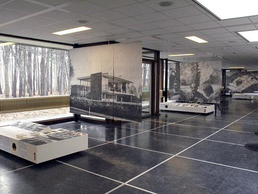
The exhibition then travelled to Twente, where it was presented by the regional architecture centre; reappeared in parts at another exhibition in Gouda (where Haan later lived).
- Related Projects
- The Demon of Comparison
- Helga Gebert: Märchenbilder